Overview #
Design a stunning Home Page for your Event App effortlessly! Introducing our Modular Page Builder template:
This module makes it easy to create a beautiful, functional home page for your event app, no coding required. With enhanced hover effects, fully clickable widgets, and customisable image-and-title sections, your design becomes more interactive and user-friendly.
Add dynamic backgrounds with images or video, fine-tune fonts and section labels, adjust widget heights, and more. You can even duplicate or rename sections and set privacy preferences for each one. Once you’re done, export your design to HTML with a click. It’s everything you need to build a polished, personalised event app homepage.
Set Up Guide #
- To start using our Modular Page Builder template, log in to the CMS and navigate to your event app.
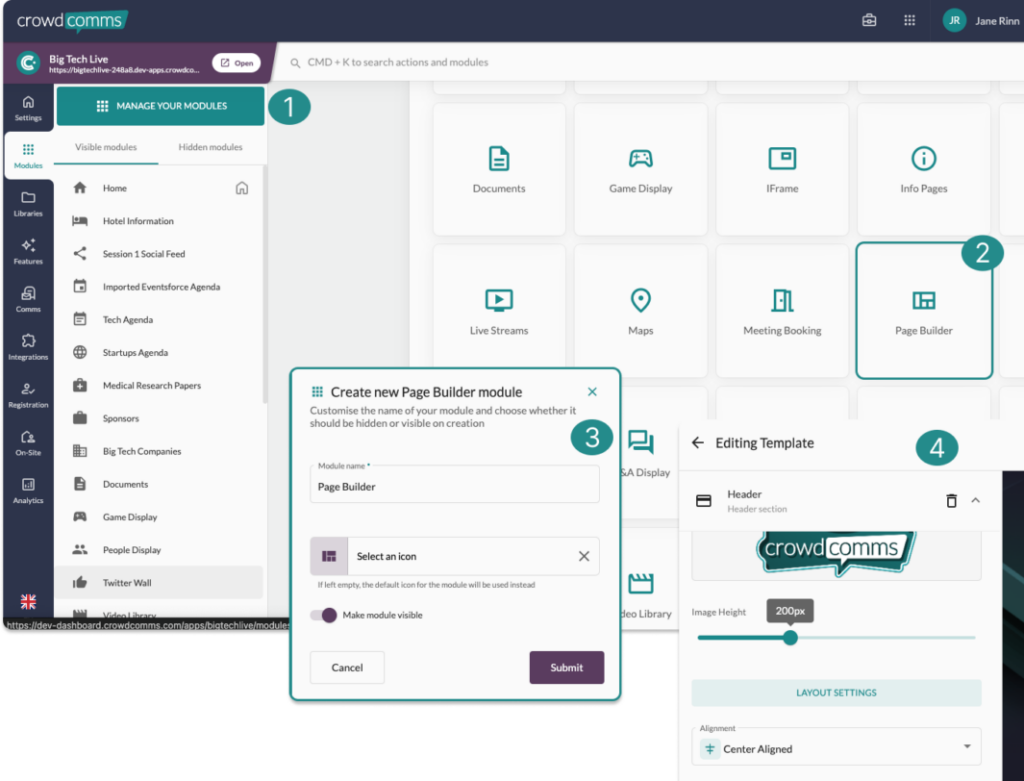
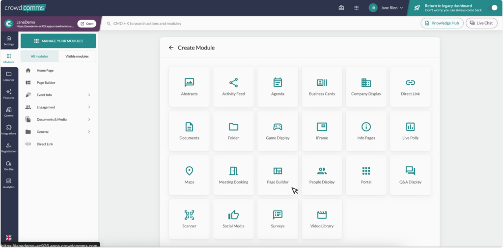
- In the left side menu select the Modules tab and on the top right, click the Create New Module button.
- You will be redirected to a grid like selection of modules to choose from, select the Page Builder module, as shown.
4. In the pop up, name your page, select an icon and choose where you want this module to be visible on the App. You can choose to make it invisible while you are building and then update this setting later once you are happy with your design. Then hit Submit.
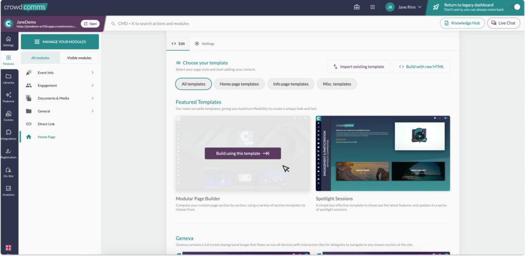
5. You will be redirected to the new module settings and configurations page. Here you will choose the template type for your page, then in featured templates select Modular Page Builder. To learn more about our legacy templates please see:
6. You will be redirected to the edit tab and settings tab for your module. On the settings tab you will be able to change the module name, icon and toggle the visibility on/off. You can also configure the module to only be visible to select groups, allowing you to have multiple home pages for different attendee types. You will also find a button to delete the module here, should you need to.
7. Navigate back over to the Edit tab and select the Launch Editor button. This will open a pre existing template that is fully customisable for your needs.
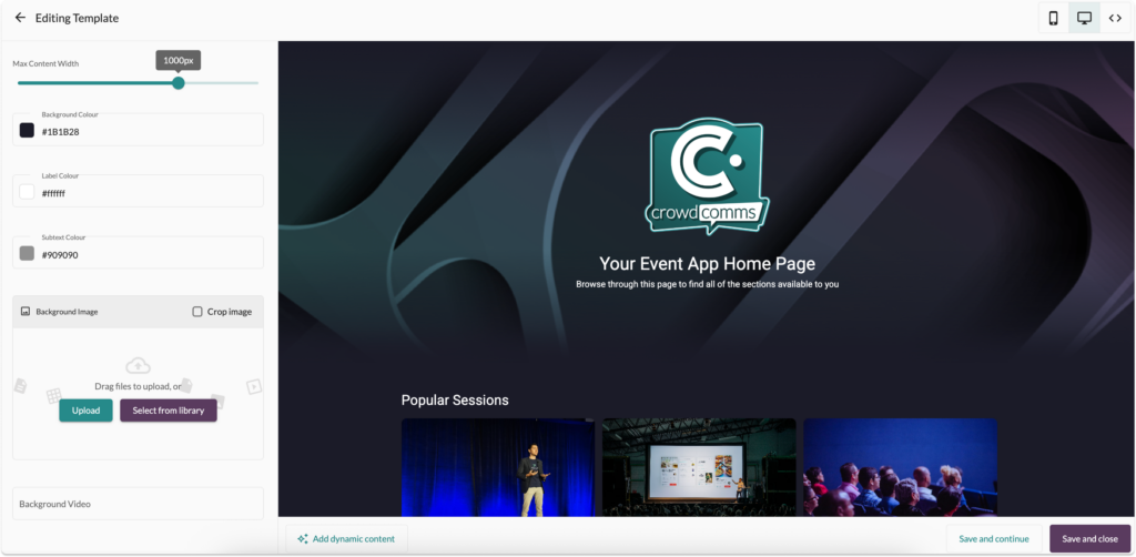
8. On the left of the page are your widget controls, in the center-right is your preview page, top right you will find three buttons that allow you to preview your design in mobile view, desktop view and to review the HTML format, where you can add custom CSS. On the bottom of the preview window is a button to add dynamic content, to learn more about this please see here.
9. In the left side bar are your content controls here you can adjust the width of your content using our Max Content Width slider, customise the Background Colour, Label Colour, Subtext colour, set a Background image or video.
10. Below these controls are the widget sections. You can use the existing ones and/or add to these by scrolling to the bottom of the list, and selecting the +Add new section button.
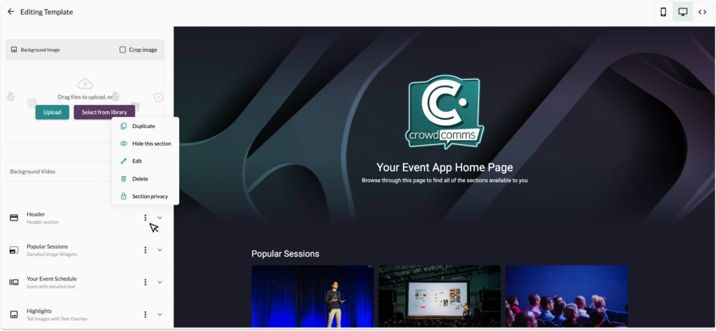
11. To edit the section label, hide, duplicate or delete an existing section, click the ellipses and select from the menu as shown below. You can also configure privacy per section here, allowing you to customise the view of the page per group.
12. To edit the section, select the down arrow to expand the section and display the controls for the section.
13. Within the section, you can fully customise the section header title, labels and subtext, the widget width, font, scroll direction, layout and add multiple widgets that can be customised further to have actions.
14. When adding a new section, you have an array of types to choose from:
- Header section
- Detailed image widgets
- Icons with detailed text
- Tall images with text overlay
- Image widgets with title
- Small icon with label
- Stacked info cards
- Footer section
- Circular widgets
- Custom HTML
- Full width image
- Countdown timer
- Info section
- Concertina section
- Image gallery
- Video with text section
- Video background on sections

15. To rearrange the layout of your sections, you can simply drag and drop them in the left side bar.
16. Once you are happy with your content and design, hit save in the bottom right corner.


