After 20 years in the events industry, one thing is constant. No matter how good your content, speakers or venue are, the first real experience attendees have is check-in. And nothing shapes that moment more than your event name badges.
Poorly designed conference badges create queues, confusion and frustration. Well designed event badges quietly do the opposite. They speed people through registration, support security measures, help networking and reinforce your event badge branding before the first session even begins.
In this article, we will explore practical conference badge design examples that genuinely speed up check-in. These are lessons learned from conferences, exhibitions and corporate events of all sizes. We will focus on design choices that work in the real world, not just what looks good on a mock-up.
Why conference badge design affects check-in speed
Check-in is a system, not a single moment. It involves people, technology, security and flow. Conference name badge design sits at the centre of that system.
When badges are clear, scannable and intuitive, staff can process attendees quickly. When they are cluttered, inconsistent or hard to read, queues form instantly.
The most common causes of slow check-in linked to badge design include:
- Names that are too small to read quickly
- Inconsistent layouts across attendee types
- Barcodes or QR codes placed awkwardly
- Overdesigned branding that distracts from essential information
- Poor distinction between delegates, speakers and staff
Good event badge design solves these problems before doors even open.
Example 1: Large name hierarchy that prioritises speed
The fastest check-in desks always have one thing in common. Staff can identify the attendee instantly.
That starts with typography.
High performing conference name badge design puts the attendee’s first name front and centre. It is large, bold and readable from at least one metre away. Surnames come second. Job titles and companies are secondary and visually lighter.
This hierarchy speeds up several moments at once:
- Staff can confirm identity at a glance
- Attendees can spot badge pick-up points more easily
- Security teams can quickly validate access
Personalised conference badges that prioritise names reduce hesitation at desks and remove unnecessary conversation.
Example 2: Clear badge orientation and consistent layout
Another common delay at check-in comes from badges being handed over upside down or rotated. It sounds minor, but multiplied by hundreds or thousands of attendees, it adds friction.
The best event badges follow strict layout rules:
- Portrait orientation for most conferences
- Fixed placement of names and scannable codes
- Consistency across all attendee types
When every badge follows the same structure, staff do not need to think. They scan, hand over and move on.
Consistency also supports accessibility. Attendees with visual impairments benefit from predictable layouts, which improves the overall experience.
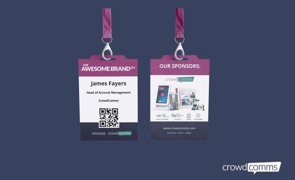
Example 3: Smart use of colour for attendee type recognition
Colour coding is one of the simplest conference badge design techniques that speeds up check-in and improves security measures.
Rather than printing different layouts, smart event badge branding uses colour bands, headers or lanyards to indicate attendee type.
Examples include:
- Blue for delegates
- Green for speakers
- Red for staff
- Yellow for press
This allows staff to direct attendees instantly without reading text. It also helps security teams monitor access to restricted areas.
The key is restraint. One or two strong colours work far better than complex palettes that confuse rather than clarify.
Example 4: Scannable codes placed where staff expect them
Onsite badging often fails not because of technology, but because of placement.
QR codes, barcodes or NFC zones should always be placed where scanning staff naturally hold the badge. Bottom right or centre lower thirds are proven positions.
Poor conference badges hide codes behind logos, place them too close to edges or reduce contrast. This forces staff to adjust angles or ask attendees to flip badges repeatedly.
Well designed event name badges make scanning effortless. That alone can shave seconds off every interaction, which adds up quickly at peak arrival times.
![]()
Example 5: Minimalist branding that supports speed, not vanity
Event badge branding matters, but it should never compete with function.
Some of the slowest check-in experiences I have seen were caused by overdesigned badges. Oversized sponsor logos, busy backgrounds and decorative fonts all reduce legibility.
Strong conference badge design uses branding in controlled areas:
- Header or footer zones
- Subtle background textures
- Single accent colours
This keeps the badge visually aligned with the event while protecting the core purpose of fast identification and scanning.
Remember, badges are operational tools first. Marketing comes second.
Example 6: Pre-printed badges with onsite flexibility
The fastest check-in experiences combine pre-printed event badges with onsite badging capability.
Pre-printing the majority of personalised conference badges removes the biggest bottleneck. Onsite printing is then reserved for late registrations, replacements or changes.
For this to work, badge design must accommodate both approaches. That means:
- Templates that print cleanly at speed
- No edge-to-edge colour blocks that slow printers
- Clear margins and safe zones
Platforms that integrate registration and badging make this process far smoother. CrowdComms, for example, supports event badges that align design, data and onsite workflows in one system. You can explore more about that approach here.
![]()
Example 7: Security-first badge design that reduces questions
Security measures often slow check-in when they are unclear.
Badges that clearly show access levels reduce the need for verbal checks. This can include:
- Printed access icons
- Zone indicators
- Date-specific badges for multi-day events
Conference badges that visually communicate access rules allow staff to enforce security without stopping the flow of arrivals.
This is especially important at larger conferences, exhibitions and events with VIP or restricted sessions.
Example 8: Durable materials that survive the first hour
It might not sound like a check-in issue, but flimsy badges create problems fast.
Badges that bend, tear or smudge force staff to reprint or replace them during peak arrival times. That slows queues and increases pressure.
High quality event name badges use:
- Thicker stock or synthetic materials
- Protective sleeves when needed
- Clear print finishes that resist smudging
Durability is part of good conference badge design because it reduces interruptions at the busiest moments.
Designing badges with the full attendee journey in mind
The best conference badge design examples do not start at the printer. They start with the attendee journey.
Ask these questions:
- How quickly can staff identify this person
- Can the badge be scanned in one motion
- Is the information readable in low light
- Does it support security measures without explanation
When event badges are designed with these answers in mind, check-in becomes calm, fast and professional.
![]()
Final thoughts from 20 years on site
After two decades of watching queues form and dissolve, I can say this with confidence. Conference name badge design is one of the most overlooked levers for improving event operations.
You do not need radical innovation. You need clarity, consistency and respect for how people actually behave onsite.
Event badge design that speeds up check-in is never accidental. It is intentional, tested and grounded in real-world experience.
Get it right, and your event starts smoothly before a single word is spoken on stage.